Sunday, August 31, 2008

#3 August 31st (3D Artist)

Man Ray- not just a photographer. He too, like many artists, successfully tested his hand at ready made art.

This piece called "Gift" is a combination of a flat iron and 13 nails glued to the bottom. The two objects represent opposite functions and connotations. When the two objects are combined, they bring forth new meaning and often a juxtaposition to fully make aware of the objects on their own.


In this case a flat iron is often associated with femininity and female gender roles. Nails and power tools represent male gender roles and masculinity.

The humor in this piece is that an iron that is used to iron out wrinkles in clothing is utterly useless if it were to have nails on the bottom. So the idea of this being a gift is hilarious, much like a gag gift.

you can see another work of his here

woops!

I guess when you add images onto this blog using a url, it just hotlinks the images meaning they wont work after some time. From now on you will see the images.

Wednesday, August 27, 2008

#2- August 27th, 2008

While making a salad at work, my imagination was running amok, and I noticed a face on the giant container of balsamic vinegarette. Near the lip of the container the salad dressing had kind of spilled and the spills looked like to wide set eyes and a mouth. I drew my interpretation of the face and it is below.


another website you should all check out is www.gigposters.com. The website is devoted to music posters of all kinds-they have to be real posters for real events and actually be printed and used. No mockups or "wish list" concerts. The website is an amazing database of artists, venues, bands, etc. My work is here.
My favorite posters today in the "recently uploaded" section (click on the photos to take you to the artists' home page):


I love this color gradient. Great minds think alike, ay? I used this very similar concept for my fleet foxes poster back in June. I recreated the night sky with black tree silhouettes and then a yellow/orange gradient to dark blue. The inspiration came from being in beautiful backyards and parks in north end Boise.


This is a really classic example of a gig poster. I think this style is still very popular today but I think was much more widely used in the 90s. The really blocky lettering (which I am sure was hand done, wonderful) almost comical. The color combinations in the inks to really make the poster pop, and the bizarre art and even style in which it is drawn. I think the poster leans more towards a very influenced Jay Ryan poster than say a Kozik.


this is a VERY popular color combination, especially as of late. I wish I knew the scientific reasoning behind why these two colors combined make for such an eye popping, badass image.

Tuesday, August 26, 2008

#1- August 26th (2D & 3D Artists)

This is the very first blog entry for the blog/journal assignment in art 108. I am hoping to make this a very interesting blog with a lot of info on cool artist and art happenings and share what goes on in my involvement in the art community outside of class.


Today after lab for art 108, a fellow student, Eli, told me about an art collective based out of Portland called Urban Honking. I took a look and here are some highlights. Eli was right when saying that the websites new design is a little hard to navigate and follow. Most of the blogs I came across were photo/food blogs but not too many that were art based. I had to dig a lot to find what I was looking for.

I cam across this entry here and found some photos that reminded me of another photographer, 
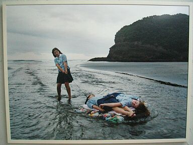
Izima Kaoru, who does a lot of imagery involving death but making it very organized and gorgeous in a twisted fashionable sort of sense. My favorite photos by Kaoru involve two children lying "dead" on a beach.

photo by Sarah


photo by Izima Kaoru


I am going to move on from Urban Honking and come back to that later. I want to share some blogs that just seem to DUMP a ton of artists for people to check out. One is for the Art Basel in Miami, a modern art gallery. This is a show from 2002, but I think the artwork in the show is still very much sought after today and still has impact on the art community now.
some favorites from the blog:

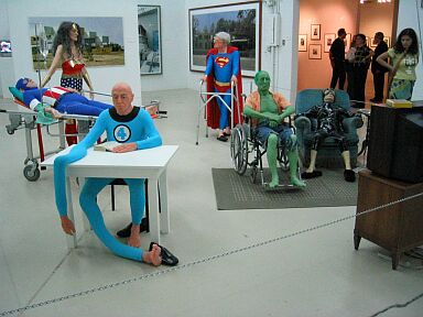
Gilles Barbier | L'Hospice 2002


photos by Justine Kurland


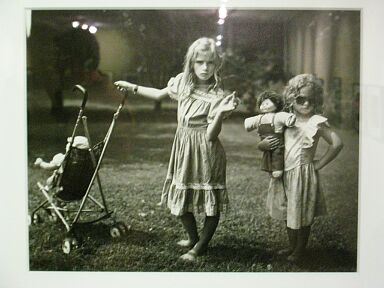
Photos by Sally Mann


others


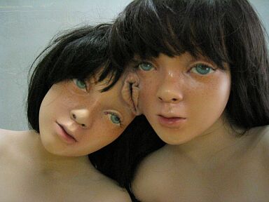
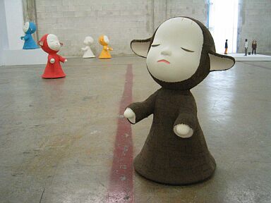
I can't seem to get away from twin imagery and super cute shit. Artist names have escaped me for the last two images, it will come back to me eventually. Often I deal with twos and the freakishly cute in my own artwork. I take from what is going on around me and that is the case for most artists. I have a twin brother but I can always remember wondering what it would be like to have an identical twin. Freaky! I don't think I could have handled it. Glad we have our own interests (except in a way we are very similar). As far as the cute imagery- I just like the idea of this fake happiness, but at the same time people CAN achieve this weird and twisted warmth from the things and events that take place around said person (myself). My life is generally pretty grand and good. My music is enlightening and really sets the tone for how I view the world around me, as cheesy as that may sound. But I generally think that someone listening to heavy metal and screaming 100% of the time must be tense and have a heavy life--or think they do. I have no desire to ever listen to anything heavier than say... Sonic Youth during "Dirty" because the album is just pure raw sex and not so much throat scaring screaming about nothing.

until then...